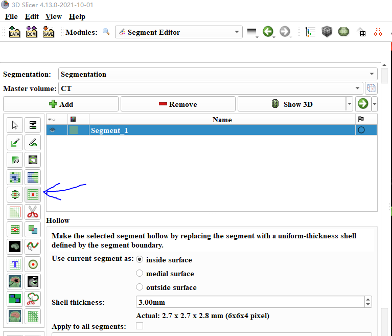
The background of these small tools will become gray after being selected. In fact, this color is not very easy to distinguish. As you can see now, if can adjust the background of the selected tool to black, or other obvious color will be better!
Thanks for the suggestion. It is a standard color scheme, which is used consistently across the application, so changing it arbitrarily in certain places would make the application look worse. It is always hard to find a good balance between a visually pleasing and functional user interface.
We plan to update all these icons with simpler design in a couple of weeks, which will hopefully make the selected tool easier to find.
Also note that the selected effect’s name appears right below the segment list.