I have a request regarding the dialog box used to edit “color and terminology codes” of segments.
In modules “Segmentations” and “Segment Editor” a double click on the color opens the following dialog:

with the left and right arrows opening more details for terminology:

Per default, in older Slicer versions it used to look like this right after double clicking the color button.
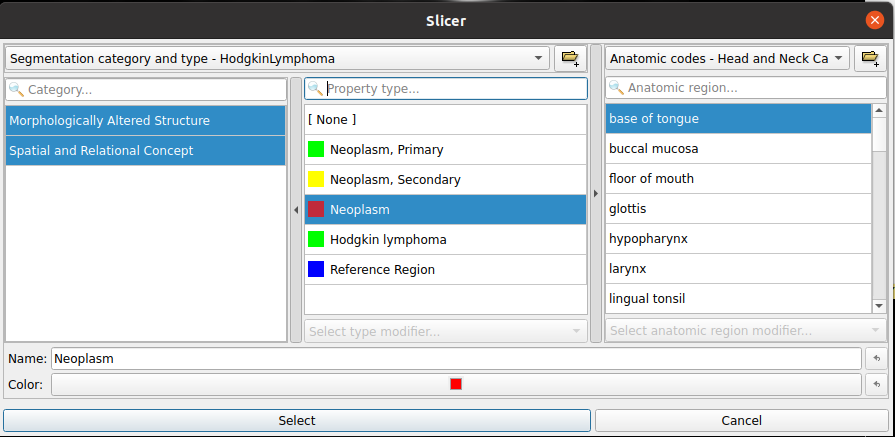
In addition, even after switching to the expanded view, every time a user double clicks the color button to edit terminology, it opens the dialog box again without displaying the more detailed terminology areas.
I guess the advanced options are hidden now by default, because it might confuse novice users. But for use cases, where users need to use the more advanced options several times, these additional clicks and resizing the window becomes very tedious.
It would be great if Slicer would remember the user’s choice about having the “Segmentation Category” and “Anatomic region” area open or not and open the window with proper width right away.