I have only used these widgets a few times in my life. Maybe partly because they are inconvenient, but mainly because I always set window/level visually (using the window/level mouse mode). Can you describe why and how do you use these widgets? Is there any workflow when you rely on setting these values numerically instead of visually?
The popup makes sense in theory (it saves space and clicks), but I think the widget is quite confusing.
slicer.qMRMLRangeWidget() solves the same task in a much cleaner way. It uses more space (the “…” button), and it requires one more click, but it is still easier to understand its logic.

When clicking on the range adjustment slider:
Most often you actually select values outside of the scalar range of the volume, so this should not be annoying or weird. If the min/max values are set to values within the scalar range then the display is saturated (=signal is lost), so this should not be the norm.
I agree that it is not useful is to allow the minimum mapped value to be larger than the scalar range maximum, or the maximum mapped value to be smaller than the scalar range minimum. However, these limits don’t help with specifying a finite range for the slider, because the minimum mapped value must still be allowed to be much lower than the scalar range minimum and the maximum mapped value must be allowed to go well above the scalar range maximum.
The logic is that maximum range of the slider is 5x larger than the scalar range of the volume (with some extra heuristics, that if the scalar range is larger than 10 then the mapped range is minimum -1200 to 900). It means that you can reduce the displayed contrast of the volume to 1/5th of the original contrast.
Mapped range = scalar range:
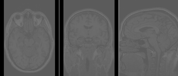
Mapped range = 5x scalar range (1/5th contrast):
To me it looks reasonable that we allow this much contrast reduction. Most details are still visible and such faded out image can be quite useful for example when the image is shown overlaid on another image.
Considering all the above, most likely the frustration is not due to the size of the accessible slider range (which seems reasonable), but how the widget appears and behaves (the popup automatically showing up when the widget is approached, and the main slider and the popup slider being too close and too similar).
What do you think about replacing the automatic popup with a ... button similar to the qMRMLRangeWidget?


