Currently same icon is used to create both a new fiducial in a list [1 below], and a new fiducial list [2] in the Markups module. This behavior is confusing to the users. I propose to modify the node creating one slightly to make it less similar. It might have visual clues to what it does (e.g., add three dots, have word Node/List on it etc).
Adding text to markups module buttons should be no problem at all (other than that the module GUI might become a bit too wide). Adding a small “+” sign to the icon is easy, too. However, I don’t think these would be enough to make the toolbar behavior intuitive enough.
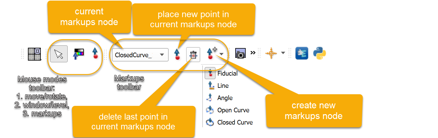
What do you think about adding a “current markups node” selector to the toolbar and having separate button for place point and for create new markups:
Normally the user arranges toolbar sections manually (move them closer to make them shorter, arrange them to multiple rows, etc.) . Automatically showing/hiding toolbar section would mess up manual arrangements. All toolbar sections are optional (you can show/hide each using the right-click menu) and Qt does some nice automatic collapsing of long toolbars and you can use multiple rows, so long sections may be tolerable.
Actually, with 4K screens and maximized view, there is more than enough screen real-estate to fit that widget into the toolbar. If anything, toolbar usually doesn’t do a good job for separating individual sections so the rest is visible.
Having said that, I am also wondering if that whole widget can be part of the Markup module by itself (i.e., move from toolbar to the markups). I usually need the rest of the functionality as well (like being able to display points, color change etc)…
It’s not a big deal, but or the record my issue with real estate on the toolbar is that I end up using the default config a lot for actual work, either because I want to test it for development or because I use a bunch of different machines and don’t want to customize each one, so the default config is important to me, even if I’m using a 4K screen. Plus of course it’s what most new users will have until the learn to customize (if they ever bother to).
My issue currently is that at the default window size already the extension manager and python console icons, which are the ones I use the most, aren’t displayed, so it’s several extra clicks (either resize the app or dig through the toolbar). I wouldn’t mind the ribbon, but also like the idea of moving a lot of the markup configuration stuff to the markups module.
Nice discussion. On my part I agree with @pieper in that the Extension Manager and Python buttons are very important but often are forced out of the toolbar, and also agree with @jamesobutler that the Scene Views toolbar should not be visible by default.
I think the ribbon interface would be an overkill. It would only make sense if we came up with a good way to use its potential: defining meaningful ribbons and populating them to put them to good use. Of course then we’ll need to allow modules to define their sections. But given that each module has a panel, and the full ribbon is not much smaller than that, it would mostly be a duplication of the module panel, and it would kind of serve as a second selectable module. If we go that way then it needs a proper discussion.
Well if we will remove the 3D Slicer logo from the module panel (https://issues.slicer.org/view.php?id=3797) that will generate a lot of space of module specific toolbars and widgets, wouldn’t it?
We are running out of space. Even if we hide scene views toolbar by default, we want to show more controls for example for markups, sequences, and layouts (favorite layouts pinned to top-level to make them available by a single click).
If space was the only issue then maybe we could dock some toolbars to the left instead of the top and/or arrange toolbars into two rows by default. But a ribbon-like toolbar+menu would also make the application look more modern and familiar.
Is there a conclusion on these long-term discussion? Meawhile, we should do something on remedying the original issue (same icon, two different functions).