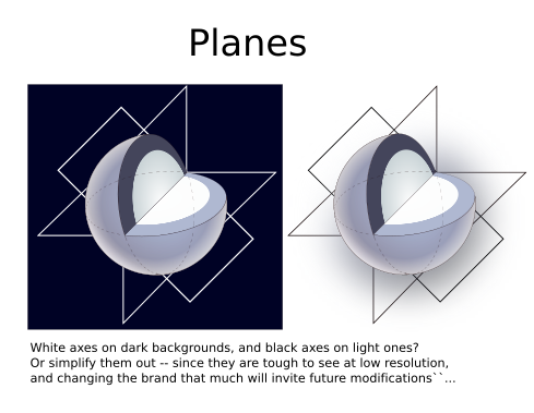
Based on a discussion that originally began in the thread, Slicer module panel icon in dark mode, I wanted to show variations of a proposed new Slicer logo that I mocked up.
My requirements:
Must be similar in design to current logo and still recognizable as “3D Slicer”. This includes shapes and colors used. Main idea is to convey 3D shapes, 2D slice intersections (axial, sagittal, coronal) and voxel based representations.
Switch to flat colors instead of shading to support logo on light and dark backgrounds with minimal or no transformation.
Reduce number of design elements and colors.
Incorporate the main color from the logomark in the text portion of the full logo. That could be just the “3D” part or the entire text “3D Slicer”. This should create a relationship between the logomark and the text.
The full logo must include the logomark with plans to use the logomark as a favicon.
Update the text in the full logo to separate “3D” and “Slicer” as a communication guide had previously defined “3DSlicer” as not correct, but “3D Slicer” which includes a space between words as correct.
**Disclaimer: All variations of the logomark and full logo were very crudely created and should only serve as a rough sketch idea. Highlighting around color borders is simply an artifact of the sketch process and can be either considered or ignored for a final design. Again, these are sketches and I am not a real graphic designer. Just a community member with some free time.
I wanted to incorporate a color from the original Slicer logo to be used as the primary color for the logomark. My preference of the main gray colors in the current Slicer logo:
Thanks a lot for working on this. I agree that it would be great to update the logo to meet today’s design trends and make it dark mode compatible.
I like the colored cutout that looks like a cube’s corner. Depending on how I look at it, it can go in or come out, quite interesting.
However, the large gray blob somehow is not nice enough. Maybe slicing it up to 2-3 different shades and/or use some other color could help. The contours around the borders are very distracting, too. It is hard ignore them.
Could you upload your designs in SVG format (preferably created and editable in Inkscape) so that we can all play around and try variations of your idea?
+1 for generating inkscape compatible svg. I also find svgedit to be amazingly powerful and convenient.
Also, for converting to svg I’ve had good luck over the years with an open source tool called autotrace which has a bunch of valuable options. It’s now also available with a browser interface which is also very convenient.
I actually really like the top one Unlike the one with the grid (at least to me), the one on the top makes it obvious it is a sphere with a cutout. Finding the right colors will be tricky I guess, because if we want to make it current, then the colors need to be “flat”, and any non-box 3D shape with flat colors may look strange.
Thanks for working on this and starting the discussion @jamesobutler!
I actually had started with the no grid first and had the same red, yellow, green colors. I then was trying to incorporate more from the old logo which was the grid of various colors. I started putting grid lines in only the red color. It had many more squares to it, but I reduced it down to the 3x3 because when the logomark was in a small size features began to disappear and then it just looked like a solid color again. I feel like the design should stay the same so that at a small size you see exactly the same thing as you would with a large size. Unintentionally the 3x3 grid is starting to look like a completed rubik’s cube.
There could be various shades of each color in each of the main 3 sections (grid or no grid). I’m currently using only 4 colors + black/white if “Slicer” text is not the main gray color. The current logo has a ton of different colors which makes it a bit complex and busy.
Some initial thoughts with this version: the grid lines for the red need to be even and the yellow and green grids probably shouldn’t be as exaggerated (in terms of perspective lines). I think the original grid treatment is better.
Of the four grays I see in the original, I think the sphere might look better with the second lightest gray, currently the sphere feels rather heavy.
The cut out seems odd to me, maybe because the colors feel like they are emerging from the sphere, instead of receding into it. In regards to the overall contour of the logo; I think you could have it be a perfect circle like this iteration, or make it closer to the original’s (where the planes seem more evident).
@jamesobutler and everyone. thanks for your efforts on improving the logo and providing great ideas.
Just wanted to share, only by removing the details on the original logo makes it much better already for both light and dark backgrounds
Also @SteveJordanKW is now working on it. hopefully we will have some nice suggestions soon.
Ooo, hey - I like those @faiza.ahmed Clean and simple. What do you think about putting the little colored squares back in the grid? I think that could be a winner.
@pieper I think once you add the colored squares back in the grid, it is almost the same as the current icon used for the app except for the main gray color no longer having shading to it.
The square grid is very difficult to see when this is used as an icon which is a smaller size. The small details get lost. It’s also difficult to see the part of the grid that extends outside the circle when the background is also black.
Hi
Thanks to all for your efforts. It’s great to see the community take on this topic.
Wendy, the original creator of the current logo and brand has kindly agreed to take a look at the logo to see how to make it work for both light and dark. Just wanted to make sure that you are aware of this.
@pieper thanks! @jamesobutler i agree, adding colored boxes will make it similar to current logo. and details wont be visible in smaller size.
This was just and experiment to see how simplified version looks.
Our designer Steve is now working on it and will hopefully come up with some better ideas.
Agreed, we should lose the small grid lines and the shading. But I like the color squares.
I think the trend is going to continue that icons will be generally bigger/higher resolution on modern interfaces, so I’m less concerned about how it looks when small downsampled.
Ron requested I try some logo rehab for dark mode, and I’ve been working on some svg logo sketches that follow your listed preferences and still reflect the Slicer brand.
I asked whether this is the time for a total rebrand, tho those changes usually coincide with a significant product change.
I’ll post a couple of sketches later today or tomorrow for you to kick around too.
It’s so nice to be in the mix with you a little bit again! Cheers!
Thanks Steve!
Here are some thoughts to kick around. Overall, I would love to adjust the main color to reflect the beautiful blue gradient in Slicer’s main window, (which is such a hallmark!) from the range of slicer-blue color we used originally.
These sketches also explore simplifying a bit while not conceptually deviating away from the brand too much. Doesn’t convey a big conceptual product change – just a polish.
Kick them around, let me know your thoughts. If you want svgs for any, let me know. Cheers,
wen


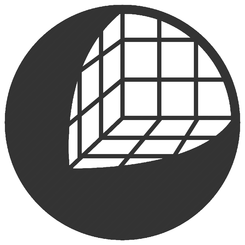
 Unlike the one with the grid (at least to me), the one on the top makes it obvious it is a sphere with a cutout. Finding the right colors will be tricky I guess, because if we want to make it current, then the colors need to be “flat”, and any non-box 3D shape with flat colors may look strange.