I like the second one, even if they are not the original colors of the labels. Love the contrast.
I like the labels not being in the center of the sphere.
I personally like the purple variations, because it includes one staple of Slicer, which identifies its usage in papers even without a citation: the famous blue-ish gradient in the 3D view! If we make the colors those colors, it could be an option.
The other color combinations are very good too. I think this design looks great in general!
I like the multi-color variation better (either the original, or the subdued one). Single palette feels like shades of gray, while multi-color brings the feeling of “variety”, which is another staple of Slicer - variety of tools, variety of ways to do things, variety of labels to identify items in the image.
Out of curiosity, I wonder how it works out when appending the discourse logo so that we know which tab corresponds to the forum:
![]()
Yes, now that I see them I like the more saturated colors better than the segmentation colors.
I agree with @cpinter that it would be nice to use the 3D view background gradient colors - maybe for the sphere?


I’m not sure the discourse logo is really necessary as there is text to it as well. ITK uses their same main logo for both their website and their discourse. The Slicer logo used when the discourse forum is a “Favorite” on safari’s new tab page on iPhone is actually the regular slicer logo and not the Slicer+discourse logo.
Having a different favicon for Slicer wiki, readthedocs, and discourse is important for me. Usually I open up all the open questions on discourse and open new tabs for looking up links on Slicer wiki to answer. Initially the favicons were the same and I had a hard time navigating all these tabs. Now it’s much more clear. I don’t know how many tabs you keep open but I never see any text on tabs:

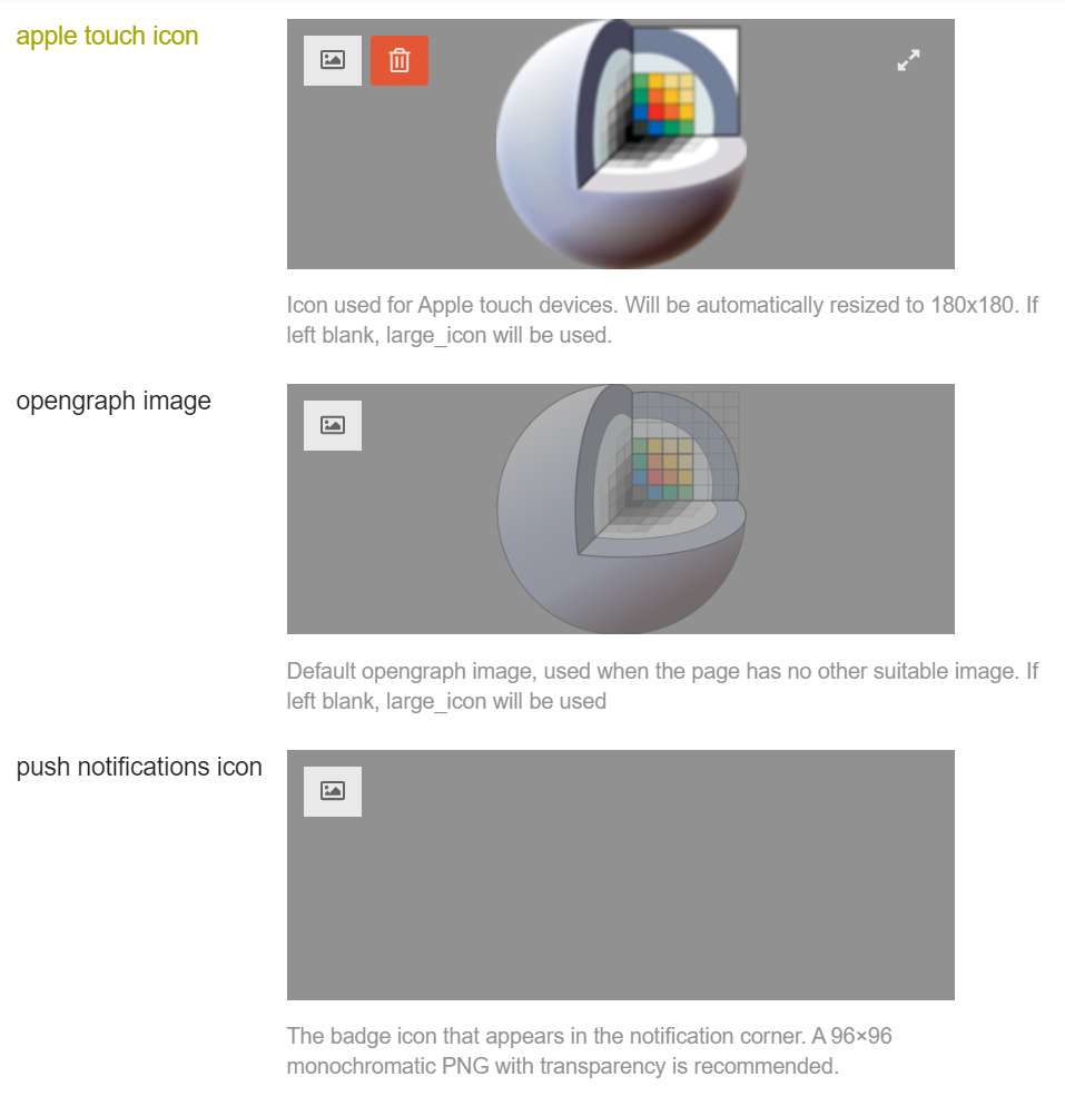
There are 6 different site icons specified on this site, if you want to change any of them then let us know.

So are we set with the logo as shown in Proposed new Slicer logo - #66 by lassoan or should we keep iterating?
- Yes
- No
0
voters

No more iterations, please! 
It seems like the logomark has been finalized, but the full logo with the text “3D Slicer” I haven’t seen yet.
The previously considered points about the full logo
- Having more of a clearly defined space between “3D” and “Slicer” as it is “3D Slicer” and not “3DSlicer”.
- Consider using the same color of the sphere as the text color of “3D” and possibly for all of “3D Slicer”. If just the “3D” then the second part would have to flip between black on light or white on dark.
- Have a horizontal and vertical version of this full logo.
@SteveJordanKW Can you provide the full logo (aka with “3D Slicer” text ) with these points?
Thanks @pieper for creating the poll, as suggested by @jamesobutler and @lassoan next steps are:
- logo + text
- favicon
- favicon + discourse
- favicon + readthedocs
Thanks @SteveJordanKW and everyone else for the help, this is exciting
To all those who are interested dark mode support and re-styling of Slicer - please comment on the topic of icon set:
Hello All,
I’ve been away for awhile and I am likely too late with these updates I’m posting. If the community is past making adjustments to the logo, then please accept my apology.
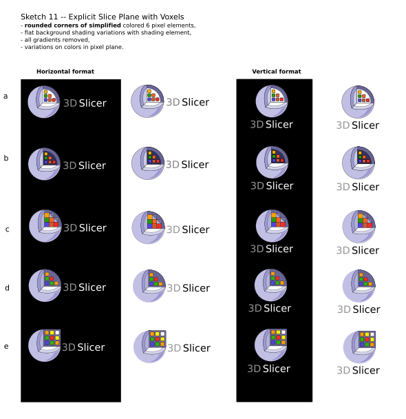
I worked on some variations to the logo, and I have worked on two complete rebrand candidates.
Any change in the logo is a de-facto rebrand in any case, tho without any accompanying changes to Slicer’s core values or vision to my awareness. So, there is an argument that this change should be one to last Slicer for the next long stretch of time.
My personal commitment to the cut sphere is easy to break, tho I think the idea of visually conveying 3D structure and data analysis is important. That said, one of the complete rebrand candidates below has part of the sphere still in it for historical purposes, but plays at looking a little like part of a brain shape.
I have svgs for all if anyone wants to play with them. If the horses are too far out of the gate, it’s on me for being late!

@rkikinis and both  Rebrand A so thank you @wenples! but also know that the poll kinda closed when @Davide_Punzo started redoing the SlicerAstro logo and it’s okay if we don’t reopen the discussion (don’t want to annoy @bpaniagua!
  ).
).
Hi I am not sure if it’s too late, but personally I like rebrand A a lot
This email is for non-work related messages
I like how Rebrand A looks, too! However, it would be such a big change from the previous design that people would not recognize it. If we want to reopen the discussion then it would be interesting to see a design similar to Rebrand A, which reslices a sphere instead (slices would be circles instead of rectangles; or at least the rectangles would change in size to form a sphere-like shape).
@wenples What do you think about the icon set redesign discussion? Would you be interested in/available for designing a modern icon set for Slicer?
HI Andras - any change to the logo now will be noticed as a change – that’s why it’s best to rebrand when the product is conceptually new in some significant way. However, whatever the change, people will get used to the new look. And a change to the look and feel is underway, so now is a fine time to depart from the grey-blue sphere.
That said, Rebrand B has the sphere still in it, sliced up as you suggested. I had a few other really. simple variations of this logo that might strike the balance for you – so I’ll include below.
Cheers!

We surely want some change (mainly to match current design trends) but keeping the logo somewhat familiar would be preferable.
I like layering of Rebrand A better (one multi-color layer and several monotone transparent layers), it would just look more familiar if we could preserve the spherical shape instead of switching to a cube.