Definitely agree with @SteveJordanKW, please no text on the sphere. I like the gray text.
I guess I’m old fashioned but I like the black stroke version. Only problem for me is that it gets lost on the black background, but I can live with that.
I agree with filling in the interior grid opacity.
I want to add a small suggestion. Currently you distribute Slicer without the logo. it would be nice for Linux users to have the logo together with the application for link to desktop purposes.
We’ve tended to avoid doing too much to support linux desktops because there seemed to be so much variation across distributions you could never know what is “standard” that should work for most people. If you can suggest changes that work well for you and are likely to help others then a PR would be most welcome.
Just wanted to touch base and see where we stand with the logo. We want to use the current logo mark (with dark strokes) with a slightly darker text to alleviate background issues?
@SteveJordanKW Thanks for following up! I think the safe answer is to yes, use the dark stroke version. I think if you take the crescent color (144,156,175) and the darkest quadrant color (98,110,127) and blend the two (121,133,151) then that color helps make it appear a little darker on white background while still being readable on the black background.
@SteveJordanKW When I tried to edit the logo in SVG format to make it look nicer when Google Chrome scales it down (see https://github.com/Slicer/Slicer/pull/5173) then I’ve realized that the dark strokes are actually not strokes but black filled shapes. So, for example there is no easy way to change the stroke width. Many of the lines are also duplicate and overlapping. What software did you use to create the logo? Does it have an option to export an SVG that has better compatibility with other software and suitable for editing?
@lassoan The logo strokes were indeed changed to outlined forms, I generally convert fonts and strokes to outlined objects to avoid some other rendering issues (or to avoid the stroke being modified when not intended). I created this vector file in Adobe Illustrator; can you let me know what stroke width you planned to use?
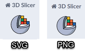
I just wanted to experiment with different stroke width and SVG shape-rendering options (crispEdges, geometricPrecision, …) to see if I can make them look better when Google Chrome renders it in relatively small size (100-200pixels).
For example, open the SVG file (this link) in your browser and you can see how bad the black lines look as you are making the browser window smaller. In contrast, if rasterize the image to png then Chrome can scale it without interpolation artifacts:
Thank you for showing these options. These seems to only affect how the SVG XML elements are encoded and not the content, so probably these would not make a difference in the rendering.
In the meantime, I’ve just tried to just add an extra stroke and maybe it looks a little bit smoother than the shapes next to it:
Could you export an SVG where the strokes have not been converted to shapes?


