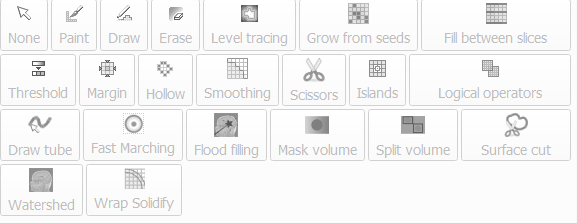
Personally, the biggest UI improvements to segment editor would come from making some of the buttons smaller, and saving some real-estate. Currently I have four rows segment effects. Some of the icons are fairly large, and because number of rows change by the width of the module panel, it gets confusing since sometimes I cannot find the tool in the place that I remember it being. (if you want to see what I am talking about in action, make sure to module panel is the smallest width possible in segment editor, then click Scissors effect, which in my case increases the panel width, and reduces the number of rows to three.).
Since we are brain storming session, I wonder if it is possible to create special right-click function for the segment editor where all effects are listed, and I choose what to work on with a single click without having to leave the slice or 3D views, where I am already doing the work?
While we are at it, would it be possible to considering merging Segment Editor and Segmentation modules in a single module panel with two tabs at the top that one can switch between (i.e., right at where Slicer icon is right now). From a workflow and conceptual point of view these two modules are so closely coupled that I am not sure if it makes sense to split them into different modules. One tab can be called ‘Editor’ and the other can be ‘Segment Operations’ or something, and the whole thing can be ‘Segmentation’ or whatever.
+1 for the dark header subsection, better contrast will help to find the subsection boundaries more clearly. @smrolfe this will be definitely useful for the GPA module of SlicerMorph