Segment Editor User Interface Improvements

I’ve been using 3DSlicer to segment and create 3d printable models mostly for Orthopaedic surgical planning. I have some background in HCI/Usability and I have a suggestion for user interface improvement in the segment editor. I created a rough mock-up below:

Editor%201

  1. I think having the 3DSlicer logo on the top left of every module (as it is now) is using up valuable space and it is not necessary. We all know what software we are using. Also the help and attribution at the top of every module is using up prime space. It may be better at the bottom of the module or as a pop-up when a help (?) icon is clicked.
  2. Having a vertical list of tools (effects) in a tool panel or palette with a contextual inspector to the right is a better use of the space and makes using the segmentation tools more efficient. There may be some debate whether a vertical icon eye scan or a horizontal icon eye scan is better, but the vertical tool icon layout has the advantage that it does not change with resize of the panel.
  3. To reduce clutter, the segments list could be placed separately to the right of the interface.
  4. Finally, when using 3D slicer for long periods, the bright interface can cause eyestrain. It would be nice to have a dark mode theme to make it easier on the eyes.

Just some thoughts for consideration.

2 Likes

Fully agree - see Slicer logo steals considerable space from the module UIs · Issue #3797 · Slicer/Slicer · GitHub.

You can enable dark mode in menu: Edit / Application settings / Appearance / Style / Dark Slicer.

Vertical tool panel seems like a good idea to me (and it would be easy to implement).

Separating the segment list and effect options as you showed in the mockup above is something to consider, but might not be the optimal choice as is, becase it would:

  • waste a lot of screen space (see all the unused areas in the image above)
  • make it necessary to cross the entire screen a few times each time you want to select a segment and an effect
  • would prevent/make it much harder to embed segment editor widget in other module’s GUI as it is not a single widget anymore but multiple widgets

I agree that Segment Editor GUI should be improved and the proposal above is a good discussion starter. We would be happy to hear further suggestions.

Thanks, I enabled the dark mode and it works fine.

I understand the issue with the segment list … I suppose the general principle is to have an interface that minimizes scrolling and expanding/contracting interface items.

Maybe the solution is a two panel sort of layout across the board. The interface of COMSOL multiphysics comes to mind (screenshot below):

A “ribbon” type interface for main functions across the top might be another solution to consider.

Ribbon interface has come up today on another discussion, too (Markups node creation icon is confusing users). Would you be interested in a mockup of a possible ribbon interface (just using a Tab Widget and dropping other controls into it)?

You can use Qt designer to create GUI - see tutorial here. You don’t need to write any code, just draw using the designer.

As a user, that sounds like a good idea to me also.

That one is quite far from ‘improvement’, being more a profound remake of the UI. It’s already an excellent UI design.

I am happy to look at it. Is it QT Design Studio that I need? https://www.qt.io/ui-design-tools

1 Like

For now, you can use any software as a drawing tool.

Qt Designer (which is completely different from Qt Design Studio) is special because .ui files that it generates can be loaded directly into Slicer. Qt Designer is bundled with Slicer (run SlicerDesigner.exe or follow steps described in the tutorial linked above).

Ahh, I found it, thanks.

As a prelude to interface design, normally functions are grouped together. So a ribbon is really an organised toolbar with tabs. What comes to mind is the trade-off between modules which is useful from a user contributed perspective versus program functions given the workflow tasks that users have to perform. So is it then that each module category below (including segmentation) could become a tab, and there would be one side panel on the left side of the screen to set options?

modules

The top menu would be:

File Edit View Segmentation Registration Informatics … Utilities Developer Tools Help

where each category is a ribbon toolbar?

I haven’t thought about putting all the module GUIs in the toolbar, but it’s an interesting idea. Maybe it could be tried on a few modules as an experiment.

What I’ve thought that the ribbon would contain selected commonly used functions, such as features already in the toolbar and menu, but better arranged, and with some more functions and options added.

How would you put the following effects into logical groupings based on usage?

None
Paint
Draw
Erase
Level Tracing
Grow from seeds
Fill between slices
Threshold
Margin
Smoothing
Scissors
Logical operators
Draw Tube
Fast Marching
Flood Filling
Mask Volume
Split Volume
Surface Cut
Watershed

Another easy change with a drastic increase in usability (in my mind) would be to have the headers of subsections clearly delineated with a higher contrast background as the following example shows:

Untitled

It makes it easier to visually scan all the properties or settings on the panel pages.

1 Like

Maybe something like this could work as a categorization:

Manual editing:

  • Paint
  • Draw
  • Erase
  • Level Tracing
  • Scissors

Semi-automatic editing:

  • Threshold
  • Grow from seeds
  • Fill between slices
  • Watershed
  • Fast Marching
  • Flood Filling

Global editing:

  • Margin
  • Smoothing
  • Logical operators

Modeling:

  • Draw Tube
  • Surface Cut

Volumes:

  • Mask Volume
  • Split Volume

How would you use these categories?

That’s interesting and indeed it would be quite easy to implement (by adjusting the style sheet). Let’s see what other users/developers think.

Personally, the biggest UI improvements to segment editor would come from making some of the buttons smaller, and saving some real-estate. Currently I have four rows segment effects. Some of the icons are fairly large, and because number of rows change by the width of the module panel, it gets confusing since sometimes I cannot find the tool in the place that I remember it being. (if you want to see what I am talking about in action, make sure to module panel is the smallest width possible in segment editor, then click Scissors effect, which in my case increases the panel width, and reduces the number of rows to three.).

Since we are brain storming session, I wonder if it is possible to create special right-click function for the segment editor where all effects are listed, and I choose what to work on with a single click without having to leave the slice or 3D views, where I am already doing the work?

While we are at it, would it be possible to considering merging Segment Editor and Segmentation modules in a single module panel with two tabs at the top that one can switch between (i.e., right at where Slicer icon is right now). From a workflow and conceptual point of view these two modules are so closely coupled that I am not sure if it makes sense to split them into different modules. One tab can be called ‘Editor’ and the other can be ‘Segment Operations’ or something, and the whole thing can be ‘Segmentation’ or whatever.

+1 for the dark header subsection, better contrast will help to find the subsection boundaries more clearly. @smrolfe this will be definitely useful for the GPA module of SlicerMorph

image

1 Like

The categories would be used to order the tools on the panels/ribbon. We discussed two alternative designs. Here are wireframes showing rough positioning of items.

Alternative 1 - Reorganized side panel layout. Click on a tool and the options panel contextually changes to the options for the tool.

Alternative%201

Alternative 2 - Ribbon Layout. The tools are organised on the ribbon in categories, and options for the the selected tool will appear in the options panel to the left.

alternative%202

NOTE: I am using the free Pencil software to do the mockups: https://pencil.evolus.vn/

I’d also like this - it doesn’t have to be dramatic, just easier to see (and if possible it could be smaller).

Similarly, I find the scrollbar to be very subtle too. The track color could be darker.

@Umesh_Persad thanks for your work on this :+1: Did you try the Qt Designer for tweaking the styles? It might help us close the gap between ideas and implementation.

Another tool people might find helpful for this and other tasks is GammaRay which connects to the app and exposes just about everything Qt-related including styles (powerful, but also somewhat difficult to use).

While these designs look elegant, I would discourage any changes to UI that will result in less viewer area than what we currently have. I often work with the four up view (if not more), and even on 4K screen, I find myself that I need to undock the panel and menus to 2nd screen to increase the viewable areas of slice views (since those are affected by the expansion of slice controllers and other viewer specific menus). That actually works fairly well, but then the mouse travel time increases and your eyes have to unfocus from what you are doing to another part of the screen to select menus and/or change options.

While going through this exercise, may I also suggest increasing the usability through more context specific menu and interactions (e.g., like right click, drop down menu of effect selection in segment editor).

I agree about keeping the focus on the images as much as possible.

Another kind of system we might learn from is computer modeling / animation systems. For example Maya has a “hotbox” that you access with the space bar and it’s pretty productive for people who spend all day in the app.

To minimize need for mouse movement, you can use keyboard shortcuts. Many of them are predefined (see Segment editor documentation) and you can define custom shortcut for almost anything.

Role of GUI is mainly to make features discoverable and easy to find. It is also very important to make the GUI look nice, because aesthetically not pleasing user interface gives the impression of bad-quality software.

It could be useful to collect the list of most important requirements and prioritize them before trying to find specific solutions. @Umesh_Persad would you be interested in looking into potential GUI design process approaches and try to apply them for this case? We can certainly use this discourse forum to continue the discussion but we could also talk about this topic during our weekly meetings or set up dedicated meetings about it; and talk in person at upcoming events (RSNA, Slicer project weeks, etc.).

I think darker section headings and moving help are simple ideas that will improve the experience a lot.
Also +1 for the confusion that resizing creates with the layout of Segmentation Effects. Any new layout that changes the location of buttons less than the current layout would be a huge improvement. Even stacking them vertically instead of horizontally in the current layout would change the order less (since some modules change the width of the left panel as Murat described).

I can assist time permitting. What my experience has shown me over the years is that it would be difficult to come up with a solution that everyone is happy with for a piece of software that is used for so many tasks. The best designs usually have a very clear vision for what is to be achieved, and there is a core design team that drives it all (with feedback from users of course). Minor changes could be implemented easily without a loss of familiarity for users.

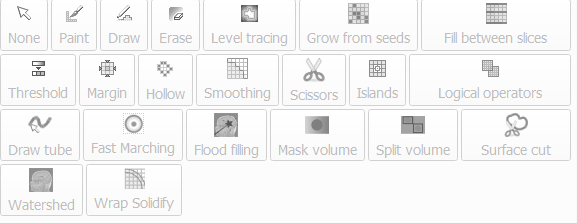
Three key principles of usability are familiarity, consistency and feedback. In other words, if the interface is similar to what people already know and use (standards), it will be easier to use. Menu names, structures and layouts are what users are familiar with using other software. For example, why “Segmentation Effects” versus “Segmentation Tools”. This was why Blender was so hard to use until the Blender 2.8 update. Experts could use it but the majority of people could not.

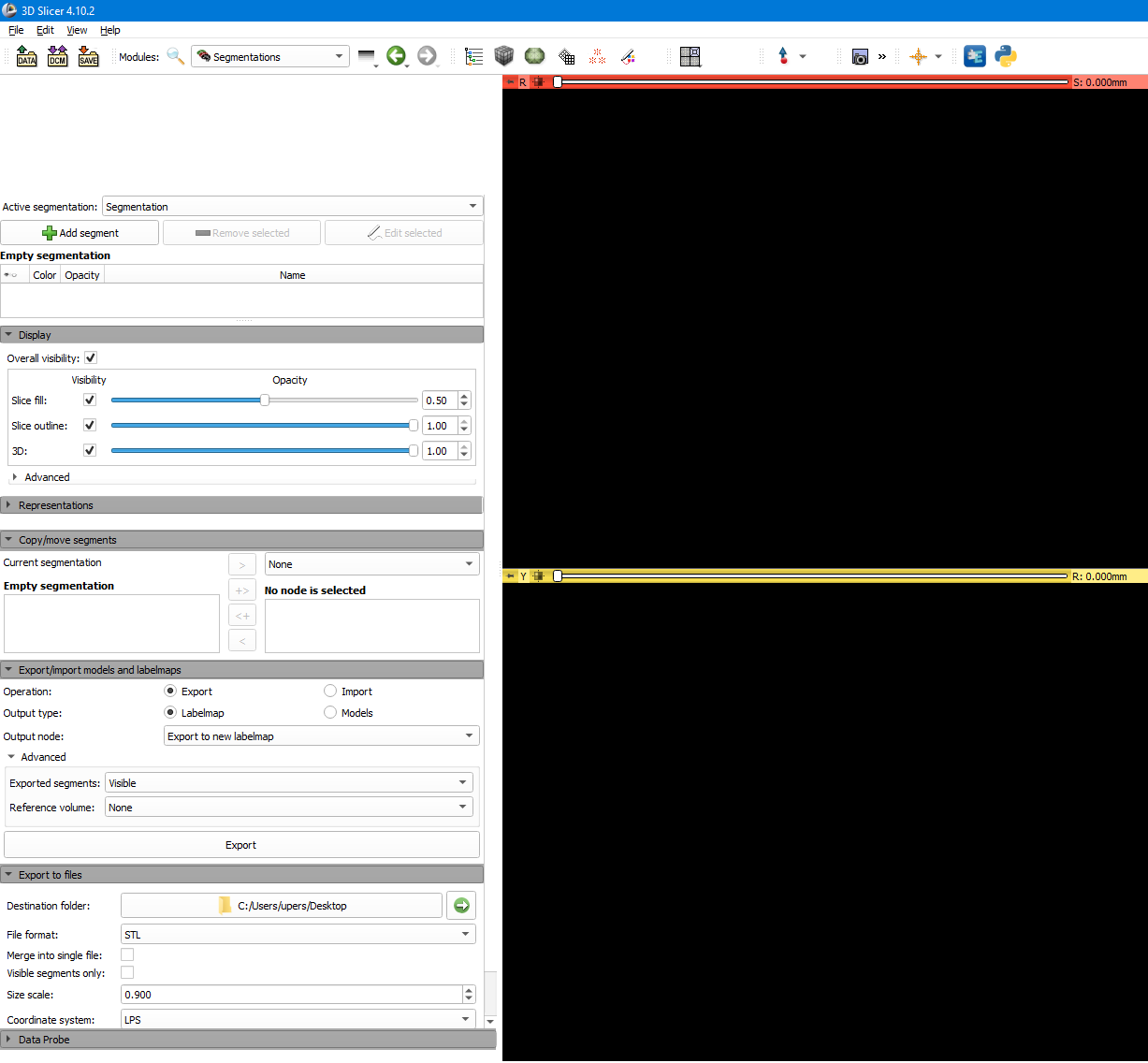
Secondly, some of the problems mentioned above are due to consistency i.e. panels should have a maximum fixed width so that they don’t allow the layout to stretch out, flow and change. It may seem that this provides more flexibility, but what ends up happening is that it trades off with usability. This is what is happening with the button layout in the segmentation effects panel. Buttons should not also stretch across a full panel and expand with panel expansion. Also for modules, maybe a style guide has to be given to developers to enforce good practice together with vetting to make sure the interface adheres.

Thirdly, on feedback, I also noticed that at times processing is taking place but there is no “being processed” feedback given leaving the impression that the program has frozen, when actually it is just taking a while to process the data. There needs to be some sort of progress bar/indicator to show this.

For the user interface to make sense, the first step is always information architecture. This is what we did by grouping segmentation effects. It must be decided very clearly what the core functionality of 3D Slicer would be and the list of functions of the core. This is the time to combine “modules” by functional area. Programmers care about modules, users care about functions (what can I do and how can tasks flow).

I can’t see any other standard layout aside from Alternatives 1 and 2 above. The left panels may look wide in the mockup, but they are intended to be narrower and take up less space with a more compact design. Menu on top and tools/options panels on the left or right or both. That is what everyone understands.

I am looking at Slicer (Qt) Designer, but it seems to be a bit dated and limited. For example, there are no modern controls like a ribbon menu. I will have to spend some time with it.